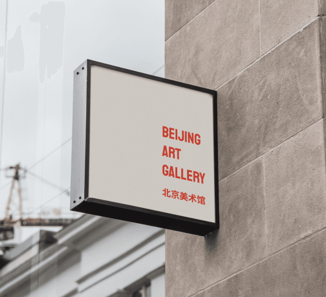
BEIJING ART GALLERY
PRODUCT DESIGN / 2022
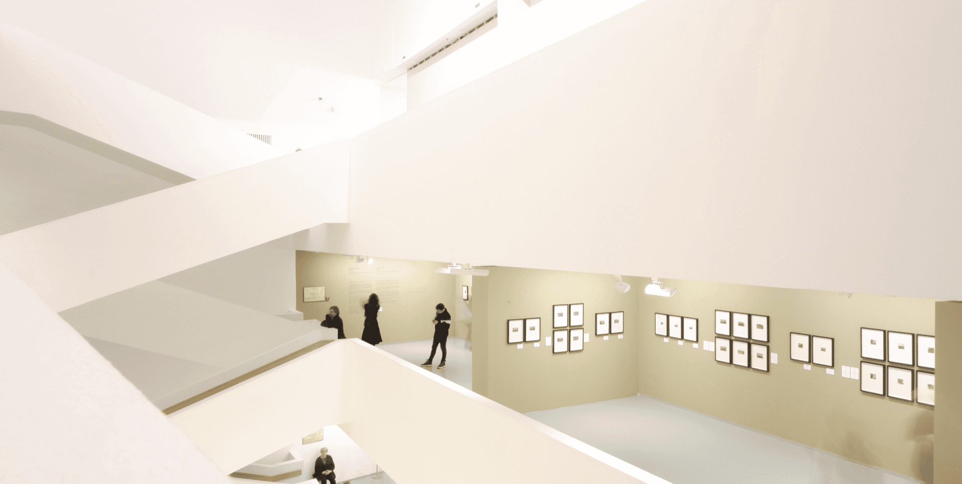
For the final project of the Google UX Design Professional Certificate course, we developed an application designed to showcase the history and beauty of Asian art. Spanning seven months, the course covered seven modules that emphasized user-centered design principles. Our case study focused on creating an immersive digital experience, allowing users to engage deeply with the rich cultural heritage of Asian art while prioritizing usability and intuitive navigation.
BRANDING
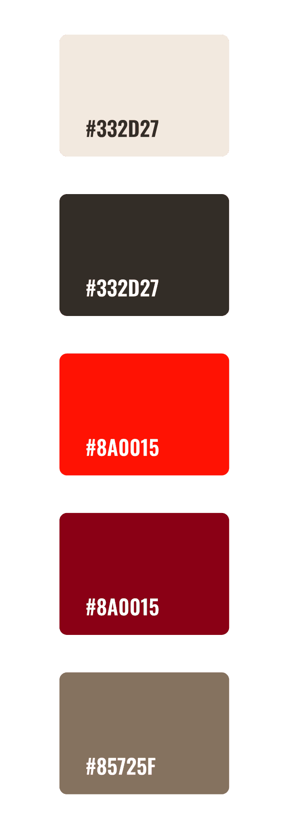
For the visual identity, an organic color palette was chosen to complement the dominant red, which is central to the brand and directly represents the colors of the Chinese flag. Red, symbolizing energy, strength, and tradition, is paired with soft, natural tones that create a harmonious balance, reflecting the fusion of modernity and the rich cultural heritage of Asian art. This color selection aims to convey authenticity and connection to history, while also providing an engaging and contemporary visual experience.
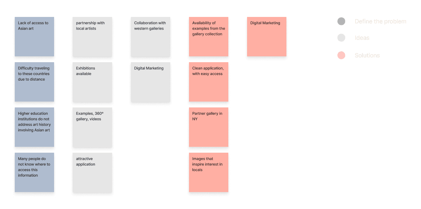
IDEATION & BRAINSTORMING
For the visual identity, an organic color palette was chosen to complement the dominant red, which is central to the brand and directly represents the colors of the Chinese flag. Red, symbolizing energy, strength, and tradition, is paired with soft, natural tones that create a harmonious balance, reflecting the fusion of modernity and the rich cultural heritage of Asian art. This color selection aims to convey authenticity and connection to history, while also providing an engaging and contemporary visual experience.
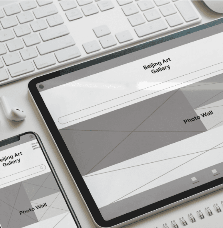
WIREFRAMES
The wireframes were designed to prioritize user experience, with a focus on intuitive navigation and an engaging layout. They aim to inspire users to explore the application and connect with the art gallery’s rich cultural offerings effortlessly.
IDEATION & BRAINSTORMING
For the visual identity, an organic color palette was chosen to complement the dominant red, which is central to the brand and directly represents the colors of the Chinese flag. Red, symbolizing energy, strength, and tradition, is paired with soft, natural tones that create a harmonious balance, reflecting the fusion of modernity and the rich cultural heritage of Asian art. This color selection aims to convey authenticity and connection to history, while also providing an engaging and contemporary visual experience.

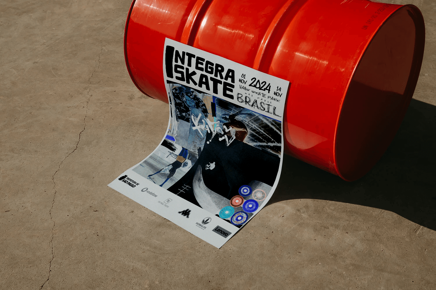
The Integra Skate visual identity is infused with the vibrant pulse of skateboarding and urban culture. Collage-style backgrounds represent the seamless connection between the raw energy of the streets and the strong sense of community that skateboarding fosters. The design incorporates bold, dynamic imagery that captures both the fast-paced action of the sport and the collective spirit of skaters coming together.
Vibrant colors like red and yellow were carefully chosen to emphasize the intensity and energy of skateboarding, adding a layer of excitement to the visual experience. These bright tones, combined with gritty urban textures, highlight the adrenaline-fueled nature of the sport while also celebrating the unity and creativity that define the skate community. This approach creates a cohesive brand identity that reflects both the individuality and shared spirit of the skateboarding world.
COLLAB
Integra Surf is still in the execution phase.
This project was undertaken through METEORA COLLECTIVE, where I assumed the role of creative director and served as one of the project's visual designers.

concept
Reinaldo Tavares/ Dominique Ganime/ Clara Tapadas
CREATIVE DIRECTOR
Dominique Ganime
ART DIRECTOR
Clara Tapadas
DESIGN
Dominique Ganime / Clara Tapadas
MANAGEMENT
Reinaldo Tavares
collage
Clara Tapadas
2024 ©
dominiqueganime