HIGHLIGHT
HIGHLIGHT
BRANDING / 2024
BRANDING / 2024
Highlight is a content agency focused on spotlighting artists on social media. Their innovative strategies construct compelling narratives, using engaging videos, visuals, and stories to ensure artists achieve a significant online presence. Beyond traditional content creation, Highlight is committed to amplifying each artist's voice and creating impactful social media presences.
Highlight is a content agency focused on spotlighting artists on social media. Their innovative strategies construct compelling narratives, using engaging videos, visuals, and stories to ensure artists achieve a significant online presence. Beyond traditional content creation, Highlight is committed to amplifying each artist's voice and creating impactful social media presences.

MAIN LOGO
The main logo was designed as a monogram featuring the letters "H" and "L," representing the brand name - Highlight.
The horizontal version (second signature) offers versatility allowing the logo to seamlessly adapt to various design settings. We chose a typography that ensures harmonisation with the main logo.
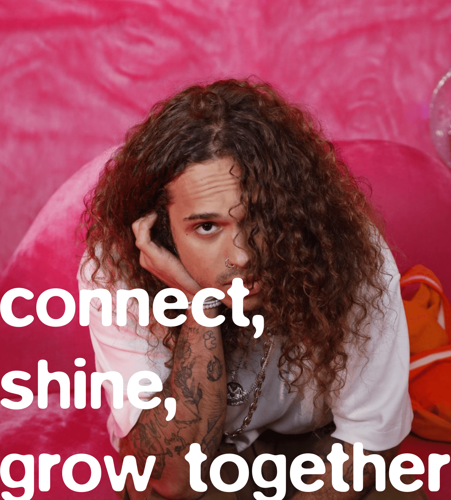
CONNECT,
SHINE,
GROW TOGETHER
The letters were crafted with a rounded shape,imparting a sense of softness that contributes toa friendly and inviting brand feel. It exudes a fun and flexible vibe. The glass effect, adds modernity and innovation, bringing depth, dimension, and realism to the design, enhancing visual memorability.
COLLAB
This project was undertaken through METEORA COLLECTIVE, where I assumed the role of creative director and served as one of the project's visual designers.

MAIN LOGO
The main logo was designed as a monogram featuring the letters "H" and "L," representing the brand name - Highlight.
The horizontal version (second signature) offers versatility allowing the logo to seamlessly adapt to various design settings. We chose a typography that ensures harmonisation with the main logo.
CONNECT,
SHINE,
GROW TOGETHER
The letters were crafted with a rounded shape,imparting a sense of softness that contributes toa friendly and inviting brand feel. It exudes a fun and flexible vibe. The glass effect, adds modernity and innovation, bringing depth, dimension, and realism to the design, enhancing visual memorability.
COLLAB
This project was undertaken through METEORA COLLECTIVE, where I assumed the role of creative director and served as one of the project's visual designers.
concept
Dominique Ganime/ Clara Tapadas
CREATIVE DIRECTOR
Dominique Ganime
ART DIRECTOR
Dominique Ganime/ Clara Tapadas
DESIGN
Dominique Ganime / Clara Tapadas/ Inês Fidalgo
MANAGEMENT
Fernanda Moreira/ Vanessa Moreira
photography
VITÃO
2024 ©
dominiqueganime