INTEGRA SURF
INTEGRA SURF
BRANDING / 2024
BRANDING / 2024
Introducing Integra Surf, designed to serve as a gateway to the World Surf League (WSL), the pinnacle of global surfing championships. Unlike traditional competitions, this circuit represents a fusion of championship-level surfing and a social project with a primary focus on inclusivity.
Integra Surf aims to break down financial barriers associated with elite surfing. It seeks to level the playing field, ensuring that surfing is accessible to all, regardless of financial means, creating a community where talent prevails over economic status.

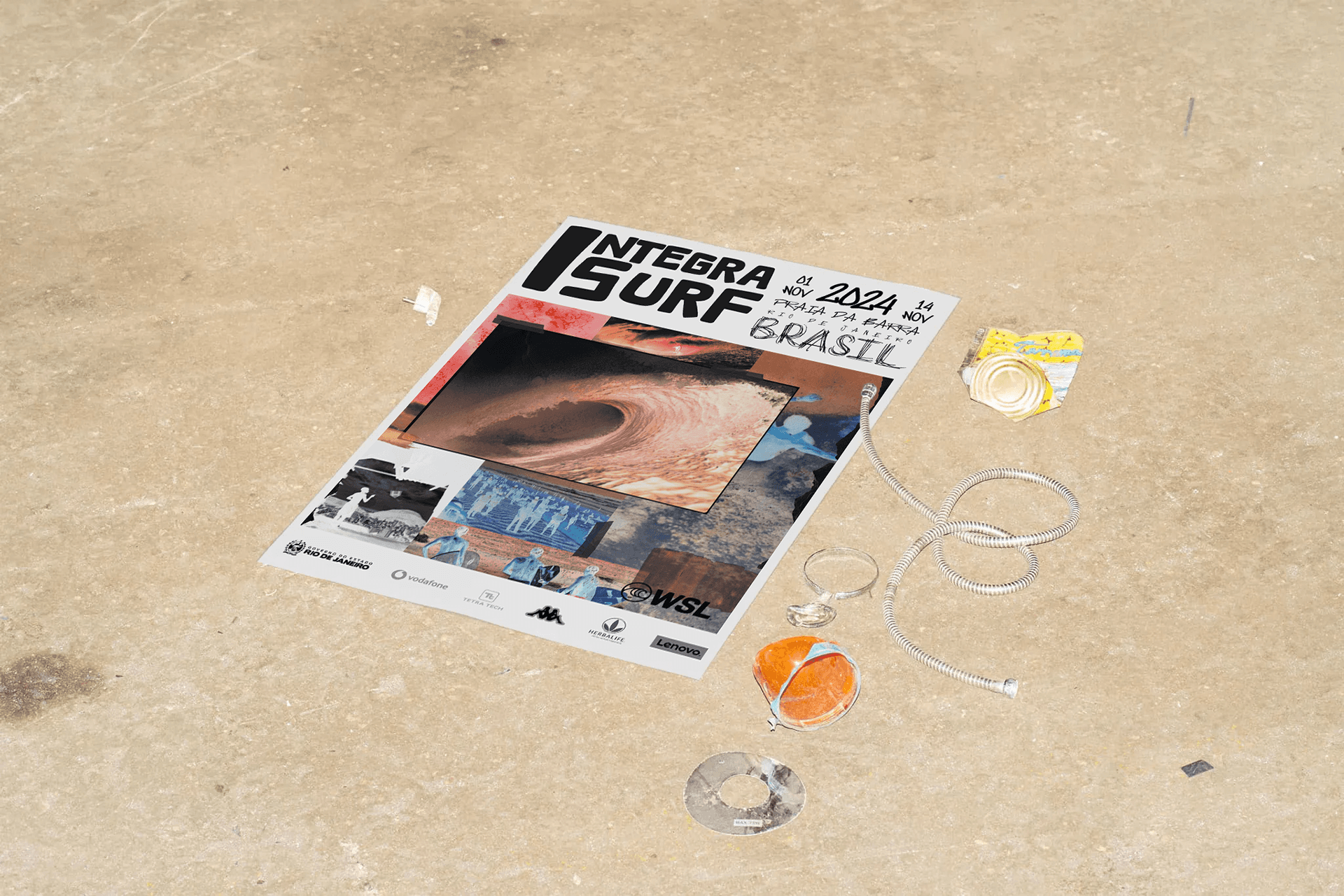
The visual identity was carefully crafted to reflect the spirit of both surfing and community. Collage-style backgrounds were used to represent the seamless connection between these two worlds, combining the movement and energy of the sea with the sense of belonging and togetherness found in the community. This visual approach highlights the harmony between nature and human interaction, creating a unified and engaging brand presence that resonates with both environments.

SURF CHAMPIONSHIP
The letters were crafted with a rounded shape,imparting a sense of softness that contributes toa friendly and inviting brand feel. It exudes a fun and flexible vibe. The glass effect, adds modernity and innovation, bringing depth, dimension, and realism to the design, enhancing visual memorability.
In addition to the striking black and white contrast, two complementary colours were incorporated to highlight any details seeking emphasis. The typography of this project aims to capture the vibrant essence of both surfing and urban environment.
With a unique blend of fonts inspired by the fluidity of waves, and the energy of streets, we seek to convey a dynamic and authentic sensation.
COLLAB
Integra Surf is still in the execution phase.
This project was undertaken through METEORA COLLECTIVE, where I assumed the role of creative director and served as one of the project's visual designers.

The visual identity was carefully crafted to reflect the spirit of both surfing and community. Collage-style backgrounds were used to represent the seamless connection between these two worlds, combining the movement and energy of the sea with the sense of belonging and togetherness found in the community. This visual approach highlights the harmony between nature and human interaction, creating a unified and engaging brand presence that resonates with both environments.
SURF CHAMPIONSHIP
The letters were crafted with a rounded shape,imparting a sense of softness that contributes toa friendly and inviting brand feel. It exudes a fun and flexible vibe. The glass effect, adds modernity and innovation, bringing depth, dimension, and realism to the design, enhancing visual memorability.
In addition to the striking black and white contrast, two complementary colours were incorporated to highlight any details seeking emphasis. The typography of this project aims to capture the vibrant essence of both surfing and urban environment.
With a unique blend of fonts inspired by the fluidity of waves, and the energy of streets, we seek to convey a dynamic and authentic sensation.
COLLAB
Integra Surf is still in the execution phase.
This project was undertaken through METEORA COLLECTIVE, where I assumed the role of creative director and served as one of the project's visual designers.
SURF CHAMPIONSHIP
The letters were crafted with a rounded shape,imparting a sense of softness that contributes toa friendly and inviting brand feel. It exudes a fun and flexible vibe. The glass effect, adds modernity and innovation, bringing depth, dimension, and realism to the design, enhancing visual memorability.
In addition to the striking black and white contrast, two complementary colours were incorporated to highlight any details seeking emphasis. The typography of this project aims to capture the vibrant essence of both surfing and urban environment.
With a unique blend of fonts inspired by the fluidity of waves, and the energy of streets, we seek to convey a dynamic and authentic sensation.
The visual identity was carefully crafted to reflect the spirit of both surfing and community. Collage-style backgrounds were used to represent the seamless connection between these two worlds, combining the movement and energy of the sea with the sense of belonging and togetherness found in the community. This visual approach highlights the harmony between nature and human interaction, creating a unified and engaging brand presence that resonates with both environments.
COLLAB
Integra Surf is still in the execution phase.
This project was undertaken through METEORA COLLECTIVE, where I assumed the role of creative director and served as one of the project's visual designers.
concept
Reinaldo Tavares/ Dominique Ganime/ Clara Tapadas
CREATIVE DIRECTOR
Dominique Ganime
ART DIRECTOR
Clara Tapadas
DESIGN
Dominique Ganime / Clara Tapadas
MANAGEMENT
Reinaldo Tavares
collage
Clara Tapadas
2024 ©
dominiqueganime
2024 ©
dominiqueganime
2024 ©
dominiqueganime