RQULL STUDS
RQULL STUDS
BRANDING / 2024
BRANDING / 2024
In the collaboration between Raquel Studios and Meteora Collective, we developed the rebranding of the brand’s visual identity. The project focused on creating a cohesive and modern graphic language aligned with Raquel Studios’ creative essence, strengthening its connection with the audience and positioning in the market.
In the collaboration between Raquel Studios and Meteora Collective, we developed the rebranding of the brand’s visual identity. The project focused on creating a cohesive and modern graphic language aligned with Raquel Studios’ creative essence, strengthening its connection with the audience and positioning in the market.

LOGO
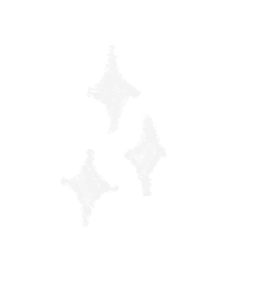
The project’s logo was designed to capture the graphic elements of the 90s, bringing a nostalgic and vibrant aesthetic. The brand name was transformed into a more impactful visual identity, where typography and shapes intertwine to create an image that goes beyond conventional reading. The star, subtly incorporated, represents the shine of a tooth, directly referencing the client’s work, as she specializes in placing dental piercings. The transparency in the logo’s layer was intentionally applied to convey the feeling of something graphic overlaid on other elements, evoking the idea of wear, as if time has left its mark on the image, making it more unique and full of character.
LOGO
The project’s logo was designed to capture the graphic elements of the 90s, bringing a nostalgic and vibrant aesthetic. The brand name was transformed into a more impactful visual identity, where typography and shapes intertwine to create an image that goes beyond conventional reading. The star, subtly incorporated, represents the shine of a tooth, directly referencing the client’s work, as she specializes in placing dental piercings. The transparency in the logo’s layer was intentionally applied to convey the feeling of something graphic overlaid on other elements, evoking the idea of wear, as if time has left its mark on the image, making it more unique and full of character.
VISUAL IDENTITY
The colors black and white were chosen to create a strong and sophisticated base, with a contrasting color added to bring subtlety and femininity, reflecting the essence of our client. The typography combines a delicate “arc with a star” with a strong, timeless font, creating a contrast that conveys balance between softness and confidence. A secondary logo was also developed, featuring a cat with a star on its tail, symbolizing personality and exclusivity, aligning with the main brand and the client’s identity.


BRANDING
The rebranding was developed around the central star of the product: the smile. This concept celebrates individuality by showcasing various smiles adorned with unique crystals, perfectly capturing the essence of the slogan, “Setting my teeth on edge—one gem at a time.” The smile becomes a symbol of personality and self-expression, central to the brand’s visual identity.
To further expand the brand’s reach and establish a cohesive identity, we designed a range of promotional materials, including posters, stickers, and business cards. These items incorporate the brand’s vibrant and modern graphic language, ensuring consistency and recognizability across all touchpoints. The designs emphasize creativity and elegance, enhancing the product’s allure.
Additionally, we introduced merchandise that goes beyond marketing—creating a sense of belonging. Through curated items that connect with the audience, the brand transforms into a community built on shared values of individuality and self-expression. This approach strengthens the emotional bond between the brand and its audience, fostering loyalty and engagement.


BRANDING
The rebranding was developed around the central star of the product: the smile. This concept celebrates individuality by showcasing various smiles adorned with unique crystals, perfectly capturing the essence of the slogan, “Setting my teeth on edge—one gem at a time.” The smile becomes a symbol of personality and self-expression, central to the brand’s visual identity.
To further expand the brand’s reach and establish a cohesive identity, we designed a range of promotional materials, including posters, stickers, and business cards. These items incorporate the brand’s vibrant and modern graphic language, ensuring consistency and recognizability across all touchpoints. The designs emphasize creativity and elegance, enhancing the product’s allure.
To further expand the brand’s reach and establish a cohesive identity, we designed a range of promotional materials, including posters, stickers, and business cards. These items incorporate the brand’s vibrant and modern graphic language, ensuring consistency and recognizability across all touchpoints. The designs emphasize creativity and elegance, enhancing the product’s allure.
Additionally, we introduced merchandise that goes beyond marketing—creating a sense of belonging. Through curated items that connect with the audience, the brand transforms into a community built on shared values of individuality and self-expression. This approach strengthens the emotional bond between the brand and its audience, fostering loyalty and engagement.
Additionally, we introduced merchandise that goes beyond marketing—creating a sense of belonging. Through curated items that connect with the audience, the brand transforms into a community built on shared values of individuality and self-expression. This approach strengthens the emotional bond between the brand and its audience, fostering loyalty and engagement.
COLLAB
This project was undertaken through METEORA COLLECTIVE, where I assumed the role of creative director and served as one of the project's visual designers.
COLLAB
This project was undertaken through METEORA COLLECTIVE, where I assumed the role of creative director and served as one of the project's visual designers.
concept
Dominique Ganime / Clara Tapadas/ Raquel Pinto
CREATIVE DIRECTOR
Dominique Ganime
ART DIRECTOR
Clara Tapadas
DESIGN
Dominique Ganime / Clara Tapadas
Photographer
NEIA ART by @neia_art
2024 ©
dominiqueganime